
This installment of the Excel Boot Camp covers three topics.
- Cell block navigation – No, this is not related to Huntsville, Texas. 😉
- Efficient ways to select data.
- Creating XY Scatter charts
Cell Block Navigation
For small blocks of data – tables that fit on one screen – the mouse is fine. But for LARGE sets of data like an FTIR spectrum that has over 2000 data points, navigating around the data set with the mouse is stupid. (Yes, I said it.)
You can navigate within a block of cells containing data in the following manner:
- Arrow keys move the cell selection one row or column at a time.
- “Ctrl + arrow” moves the cell selection to the far right, far left, top, or bottom of the block of cells according to the arrow that was used.
- “Ctrl + Home” moves the cell selection to cell “A1” – the topmost corner of the sheet. This is very handy.
- Ctrl + PgUp and PgDn change the sheets. (That’s ripe for a meme.)
- “Ctrl + End” moves the cell selection to the bottom-right corner of the data on a sheet.
Selecting Data
Adding the Shift key to the above sequences allows you to select large chunks of data. This is necessary for EFFICIENTLY charting what you want to chart.
Say I had a data set with an x-values column and 15 y-values columns. And furthermore, I only want to plot the first three y-columns against the same x column.
- I left-click the x-value column header.
- I press and hold Shift.
- I tap the right arrow 3 times.
- I add the Ctrl key so that Ctrl and Shift are BOTH pressed.
- I tap the down arrow, and voila! A block of the x-values and three columns of y-values are selected and ready to chart.
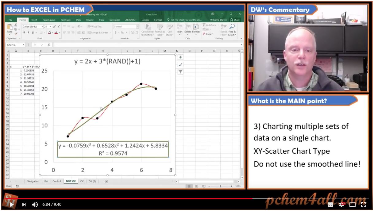
Charting Pro Tips
Since this is so visual, I’m going to punt and say “Watch the video…“
I welcome your comments, likes and subscribes. You know the drill.
Happy pchemming!
DW
